Find answers to all your account-related questions. From password resets to user management, we've got you covered.
We continuously monitor the status of our platform. Any interruptions in service will be posted here.
Learn how to implement our APIs for your business. From sending SMS to adding payments or voice.
Discover the most recent improvements and features releases of our platforms.
Discover everything about your Engage product with our e-learning platform.
Can't find the answer you are looking for?
The CM.com support team awaits your every question.
Contact support teamAI agents are your virtual helpers. Digital employees designed to perform specific tasks within an Agentic AI framework. What type of tasks? Pretty much anything you can think of: Analyzing data, writing emails, automating cancel or renewal processes, creating tickets, and so on and on and on. But how do you create these AI agents? Let us show you how.
Looking for a smart and capable employee that never sleeps? A little helper that can take over all your menial and repetitive tasks to make your life a little easier? One that will continuously learn and improve itself to keep assisting you the best it can? This may sound like a dream (and an unrealistic one at that), but it's much closer to reality than you might realize! Discover Agentic AI!
Your contact page is the ultimate business card for your customer service and provides a direct connection to your customer service team. It's a crucial part of the customer experience where you have the chance to significantly enhance the experience right away! To make this happen, the page needs to be well-designed. In this blog, you'll discover 8 steps you can take to make your contact page irresistible!
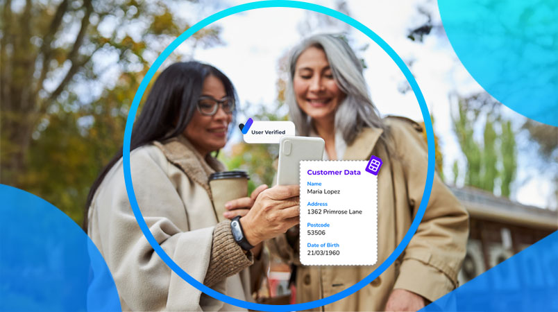
In today's digital world, ensuring secure and convenient online interactions is more important than ever. Every business has unique needs when it comes to protecting their digital space and their customer interactions - and different needs require different solutions. That's why CM.com introduces "Build Your Own Verification" - flexible and customizable verification that can be tailored to your specific needs.
In the same way that growing your event feels inevitable when you’re deep in promo mode and ticket sales are rolling in, the opposite is true when there’s nothing specific to promote. The off-season can feel like a barren time for promoters, lacking the natural marketing boost that an upcoming event provides. But it doesn’t have to be that way. Below, we’ll share insights and strategies to help you maintain momentum even when there are no events on sale. If you’re ready to implement a more sustainable event strategy - one that goes beyond the sugar rush of ticket sales and social media growth - this one is for you.
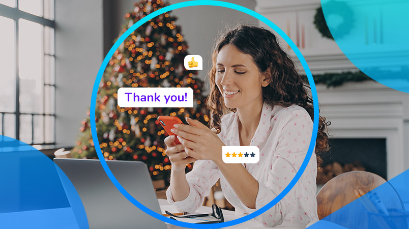
The holiday season is right around the corner, and it comes with a golden opportunity to connect with your customers in meaningful and personalized ways. Messaging channels like WhatsApp, RCS, and SMS can help you create an unforgettable customer experience this Christmas. Stand out by sending curated offers, support, smart deals and festive cheer directly to the phones of your customers. In this blog, we’ll explore how leveraging these channels can not only enhance customer satisfaction but also drive sales during the busiest time of the year.
Verifying online users and accounts has become indispensable in today's business landscape. You want to know who has access to your (online) services and data, but even if you couldn't care less, rules and regulations will definitely care! Whether it's to protect yourself and your customers from harm, or making sure you abide by the local law - making sure you know who the person on the other end of the internet is, is paramount.
Black Friday is a huge shopping event, drawing crowds of eager shoppers hunting for deals. But after the frenzy fades, the real challenge begins: turning one-time shoppers into loyal, repeat customers. Customer retention is vital for long-term success and post-Black Friday is the perfect time to build lasting relationships. So, how can your business retain customers post-Black Friday? In this blog, we’ll explore how to make it happen.
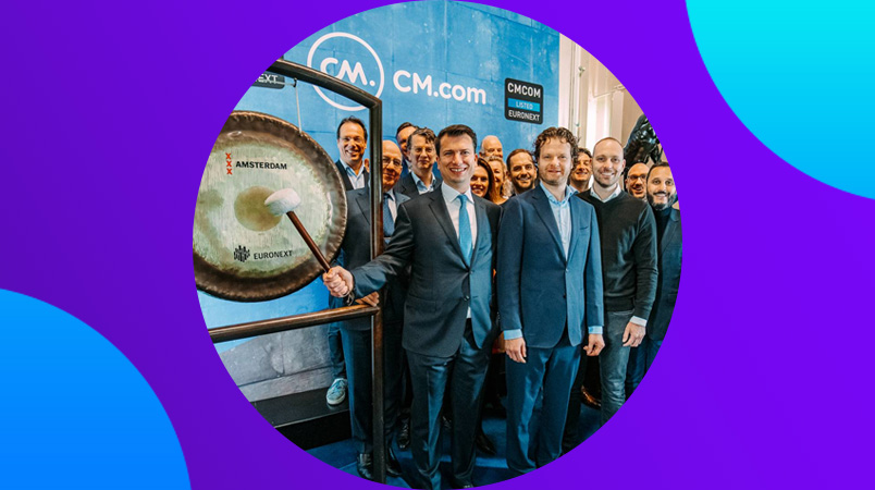
Over the past five years, we’ve made it our mission to stay ahead by adapting quickly to change and seizing new opportunities. Despite the challenges—like the global pandemic—we kept growing by staying flexible and making smart decisions. In this final blog celebrating 25 years of CM.com, we look back at a time when we showed, again and again, how we could offer innovative solutions and strengthen our organization.


